
How to find the best dividend stocks?
INTRO
In this article I design a dividend stocks screener in chartmill that looks for companies that have been paying a very solid dividend for quite some time and are most likely to do so in the future. Beware, simply choosing companies that pay a very high dividend is not the way to generate a stable cash flow. Focus on companies with an irreproachable dividend track record (i.e. no interruptions) and where the dividend is growing steadily.
Dividend investing is and remains popular and the main reason for this may well be psychological in nature. Compared to other forms of investment, dividend investing offers one advantage that should not be underestimated; the regular dividend payments provide an additional stable income stream. The fact that a carefully composed dividend portfolio has always delivered good returns and is certainly not inferior to other strategies only makes this form of investing even more popular.
A FEW INTERESTING REFERENCES
In 2005, the S&P 500 Dividend Aristrocrats list was launched. These are all companies that meet the following criteria:
- The company is part of the S&P500 index,
- The total dividend per share must have increased for at least 25 consecutive years,
- The market capitalization is $3 billion minimum
- The company must have traded an average daily value of at least $5 million for three months prior to the reference date.
On December 13, 2021, 65 companies met the conditions.
There is a similar list for Europe. The S&P Europe 350 Dividend Aristocrats. This is an index of European companies that, as for the U.S. version, have continuously increased their dividends. However, the criteria are a little less strict; for example, there is a minimum term of 10 consecutive years.
For the European version, on December 13, 2021, there are 40 companies that meet the set criteria.
IF IT SOUNDS TOO GOOD TO BE TRUE...
...it probably is! The Dogs of the Dow Strategy for example. This is a dividend strategy that is applied exclusively to stocks that are part of the Dow Jones Index. The idea behind the strategy is to invest every year in the 10 stocks with the highest dividend yield. The weighting is thus 10% in each stock. Each year, the calculation is made again and, if necessary, the portfolio is revised.
Between 2009 and 2019, this produced excellent results with an average annual return of no less than 15.9%. This outperformed the Dow Jones Index which achieved an average return of 13.9% in the same period. But before you get too excited.... 2020 brought an abrupt end to this outperformance. In fact, it was a crappy year for the Dogs of the Dow strategy with a negative return of -12.7% while the index itself achieved a positive return of 7.2%. This completely wiped out the entire outperformance in the previous 10 years!
Update
- The Dogs of the Dow 2021 recorded a gain of 25.3% compared to 21% for the Dow Jones 30 index.
- The Dogs of Dow 2022 recorded a gain of 2.2%, outperforming the Dow Jones 30 index which lost -8.8%.
- The Dogs of Dow 2023 recorded a gain of 10.1% which was lower than the 14.4% gain on the Dow Jones index.
The current Dogs of the Dow List 2024
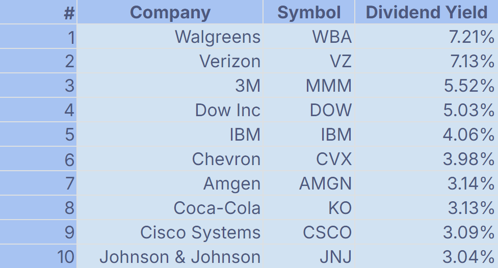
Specific market conditions certainly play a role in this but for the Dogs of the Dow, it should be clear that keeping "highest dividend yield" as the only rule is definitely not the best strategy. Later in this article it will become clear as to why this is the case.
STOCK SCREENING FILTERS
To retain a list of quality stocks that have structurally paid a nice dividend in the past and are likely to do so in the next few years, a good stock screener like ChartMill is an incredibly useful and time saving tool.

Because certain parameters are highly related to the sector in which a company operates, we will start with some general dividend filters. We will then use this first basic selection to ad some other more specific filters. However, the valuations we will use for these additional filters are region- and sector-specific, making them of little use as general filters.
BASIC FILTERS
Dividend Yield
The dividend yield represents the ratio of the annual dividend (paid by a company) to the most recent share price. So if the stock price is quoted at $100 and the dividend is $3 then the dividend yield is 3%. By default we set this filter between 2 and 6% (standard filtering available).
The reason for this price range is simple. Companies that pay no dividend or too low a dividend are immediately filtered out. The fact that companies with dividend yields higher than 6% are excluded at the same time may seem a bit odd but this also has a very specific purpose. As we already mentioned in the introduction, we are mainly looking for stable companies that have been paying regular dividends for a long time and that are also continuing to increase their dividends. We are not interested in companies that increase their dividend substantially one year and then suddenly pay much less the next year, or in the worst case, not pay any dividends at all. This would only mean that you would be forced to sell the shares, after which you would have to look again for alternatives. This generates additional transaction costs, which has a negative effect on the total return of the dividend portfolio.

Dividend Growth
Companies that consistently increase their dividend over the long term generally do better than the stock market average. This is why we also keep this parameter in our selection. It is likewise tempting to choose only the companies with the highest dividend growth, but here too, stable, calm growth has priority over exponential growth, which cannot be sustained over the long term anyway. This criterion is perhaps even more important than the dividend yield filter because dividend growth, together with a strong stock price, has a double effect on the total return.
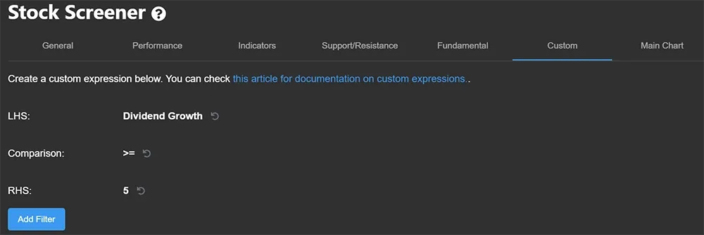
In the stock screener we therefore choose a moderate growth rate of minimum 5% (custom filter) and maximum 30% (standard filter available). We start quite low in order not to thin out the basic selection too quickly and thereby miss out on a number of large established companies. Once we refine the basic selection on sector level, we can - if necessary - still change this parameter.
To set up the custom filter select the custom menu in the stock screener. In the next screen select 'property' for the Left hand Side of the Comparison (LHS) and then choose 'Dividend Growth' (press the 'D' key several times). Next to Comparison mark 'greater than or equal to'. Next to RHS select 'Constant' and then specify the value "5". Now press enter and then press add filter.
Setting up the standard Growth filter (max30%):

Dividend Payout Ratio
How much of the net profit does the company distribute to shareholders? That amount is calculated by dividing the dividend by the company's net profit (after taxes). The result is then multiplied by 100% to calculate the ratio. This payout ratio is available in the stock screener.
New companies generally have a rather low payout ratio because a large portion of profits are reinvested (with the intention of achieving/funding further growth). Large companies, where the further growth opportunities are much smaller, will usually pay out a larger portion of the profits in the form of dividends. You should be careful with payout ratios that are too high, as this can have a negative influence on the further growth of the company. By default, we set the filter to a maximum of 70%. Again, this value is used as a basis and can be adjusted to the sector average later if necessary.

For this ratio, we also add a custom filter to avoid including stocks with a negative payout ratio in the selection. Indeed, A company may still decide to pay the dividend even though no profit was made. This may be a delibarate choice to keep shareholders satisfied. However, it is obvious that such a strategy is unsustainable. The company will have to use its existing cash resources or even attract additional debt capital in order to (continue to) pay the dividend. As a long-term dividend investor, it is obvious that you want to avoid such situations.
Setting up this custom filter goes the same way as the custom filter for dividend growth but with the following changed settings:

ADDITIONAL FILTERS
Volume (region-specific)
Whether you are choosing a dividend investment strategy or any other strategy, sufficient liquidity is always important. For the US market, we apply an average minimum volume of 300,000. For Europe and Canada, we are required to reduce this filter significantly to 100,000, otherwise there are too few companies left that meet all the criteria.

Market capitalization (region-specific)
This filter shows the total market value of a company. This is simply calculated by multiplying the number of shares outstanding by the share price. I use a market capitalization of at least 2 billion for the US market in this screen. After all, these are medium-sized companies that already have a certain track record and for whom it can be assumed to remain stable in the future. Moreover, the advantage of larger companies is the much greater predictability of their cash flows.
For Europe and Canada, this has been scaled back to 1 billion, but you could possibly opt to include the smaller companies as well, which gives you slightly more potential candidates.

Return on equity (sector-specific).
This refers to the ratio of the company's profits to the company's equity with which the profits were achieved. The higher this figure, the higher the profitability of the company and the more attractive the company becomes to potential investors. A high figure means that the company manages its equity in a very efficient way. The value is expressed as a percentage and is obtained by dividing the net profit (after tax) by the company's equity (*100%). Sometimes 'net profit before tax' is also used, but our screen filter only uses 'net profit after tax'.
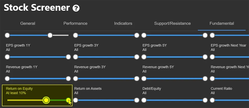
What percentage return on equity you need to retain depends heavily on the sector. The average for the S&P500 companies is around 18% but per sector the differences can be large. For example, you can use a minimum of 10%. After this first pre-selection, you can further fine-tune the results and compare the companies within the same sector.
Debt to Equity (sector-specific)
In wich debt capital is used to finance a company's assets. The higher this figure, the higher the proportion of debt capital and the higher the risk. As a dividend investor, you are mainly interested in stable companies that can continue to pay dividends over the long term, so you should avoid companies with a lot of debt. Keep in mind that this figure strongly depends on the sector in which the company operates. Capital-intensive companies (aircraft manufacturers, car industry) will generally need (much) more loan capital than companies in the service sector.
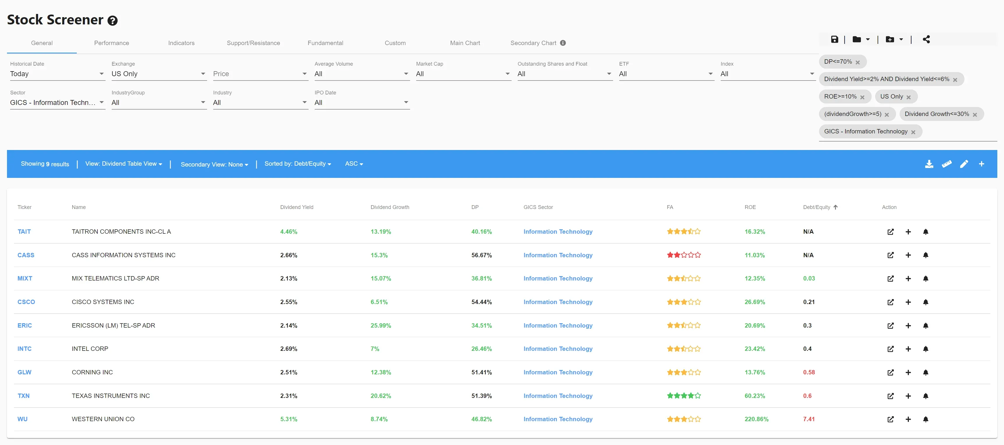
Looking at the 'Information Technology' sector, we notice that of the 9 US companies, only three show a red debt/equity figure. This is because, on average, this sector requires less capital to operate.
Now let's have a look at a capital intensive sector such as 'Industrials'. You will immediately notice that the average Debt to Equity ratio is a lot higher. So it makes little sense to use a low Debt to Equity ratio as a general filter. Moreover, it would ensure that the dividend portfolio is mainly focused on low-capital-intensive companies. Nothing wrong with that if that's the goal but it can be a problem if you want to diversify the portfolio across as many sectors as possible.
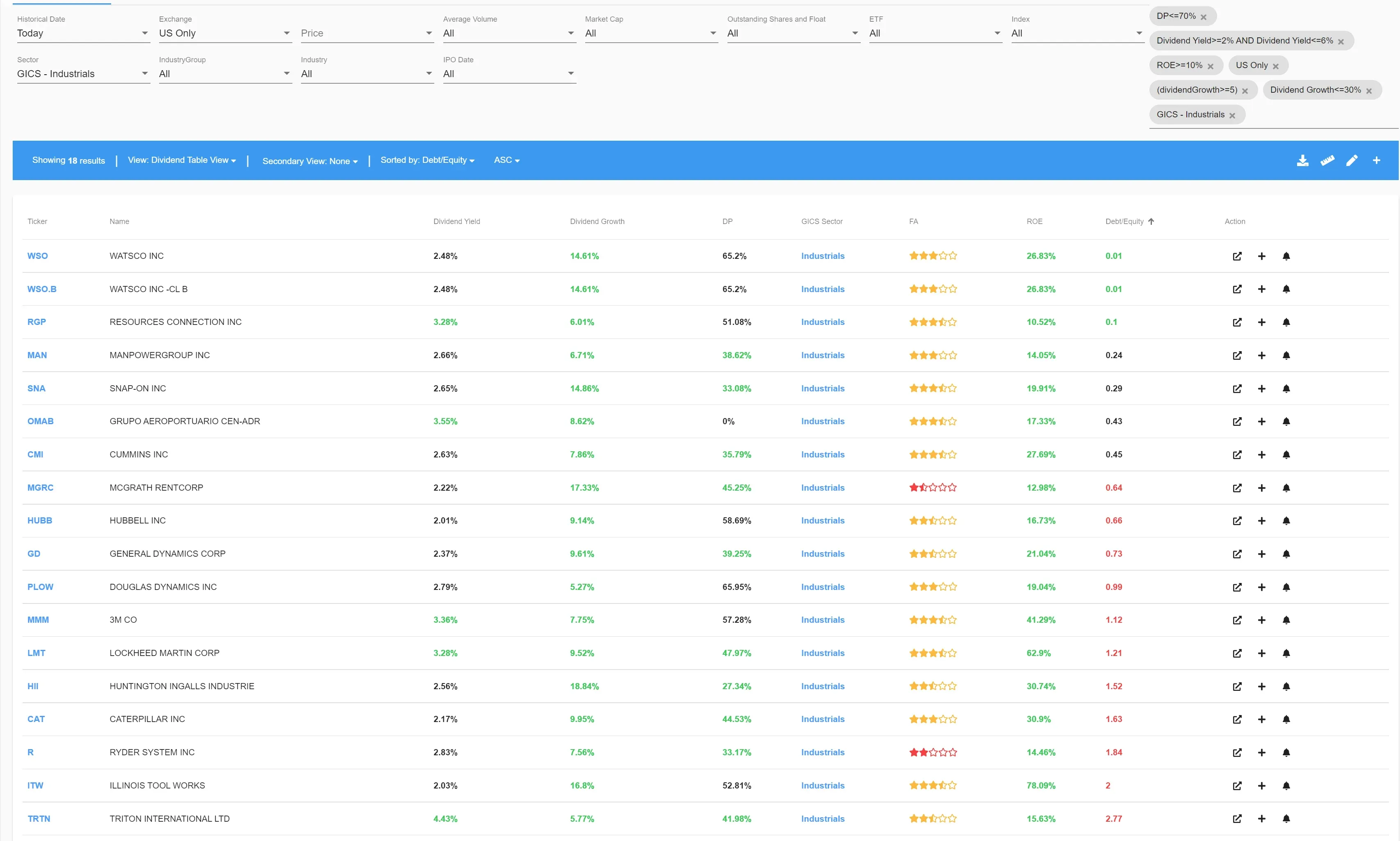
So always compare the debt to equity filter at sector level,the topo 10 to 20% with the lowest figure are preferred.
Debt to Equity >< Return on Equity
The 'Debt to Equity' ratio has an additional monitoring function. In particular for the published figure 'Return on Equity'.
View Western Union'sfigures in the table below.

At first glance, Western Union seems an excellent dividend stock. A Dividend Yield higher than 5% with the last 5 years showing a dividend growth of almost 9% and a payout ratio of less than 50%. The return on equity is remarkably high, over 220%.
However, that high figure is calculated solely on equity and does not take into account long-term debt (debt) , creating a distorted picture.
An example: Company X has a return on equity of 20%. If we take a theoretical (and for the sake of simplicity) equity of $1000, this means a profit of $200. Suppose, however, that the company takes out a loan in order to expand, adding an additional $1000 to the $1000 of equity, and as a result the total profit of the company increases to $300. If in the process the cost of debt (after taxes) is less than the additional return generated, this financial leverage will increase the return on equity. This is very noticeable when we look at Western Union's table, this time however added with the Debt to Equity ratio...

This does not necessarily mean that for those who have Western Union in their dividend portfolio , immediate danger looms… But it does show that the company has a fairly large debt ratio and is therefore bound by capital and interest payments. Since these are fixed, they will weigh more heavily in times when the company is experiencing less positive results.
As an investor, you have to be aware of this. Whether you want to run this risk is a personal consideration. But it seems obvious to me that if among the results there are companies with similar figures and (much) less debt, the choice is quite obvious.
VIEWING RESULTS IN THE SCREENER
The summary table above showing the various dividend filters along with the ROE and Debt/Equity ratio is not present as a standard view in ChartMill. In the video accompanying this article, I show how to create such a table view in the platform.
Explore the 'related screens' section next to this article for some predefined trading ideas.
ADDING A TECHNICAL TREND FILTER
Once you have a list of stocks that meet your criteria, it's time to make a final selection. For this purpose there are several possibilities, for instance you could take into account other fundamental indicators which examine the financial health of the company in even more detail. Another possibility is to consider the current technical trend of the stock. Determining this trend is very easy, for example based on the ChartMill Trend indicator. This is used by default on the weekly timeframe and is therefore by definition suitable for a long-term view. In this way, you get a quick visual overview of which stocks from your final selection are in a long-term upward or downward price trend.
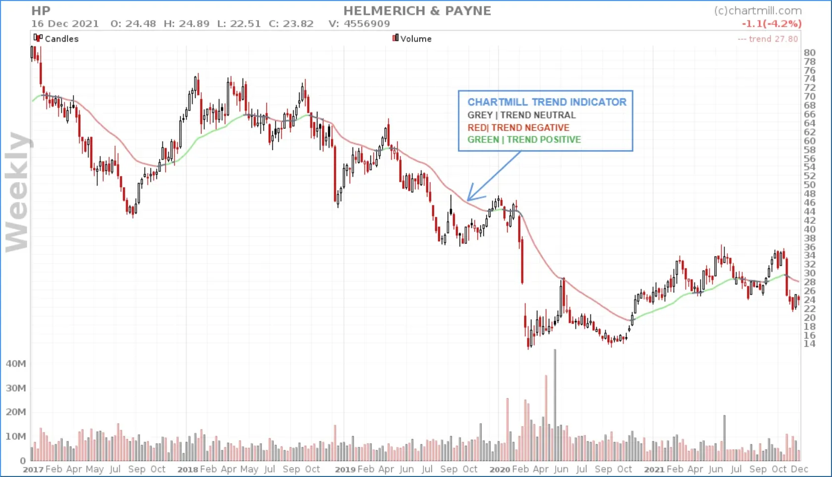
How to use this indicator as a filter and add it to the chart is explained step by step in the video accompanying this article.
TO CONCLUDE
It may be clear that a quality portfolio of companies that have been paying a nice dividend for a long time can add value to your investment goals. However, don't make the mistake of blindly selecting the companies with the highest dividend yield or the fastest dividend growth. The filters I have set up using ChartMill provide a good mix that focuses mainly on gradual growth and consistency where some of the ratios used need to be examined and compared at a sector level in order to interpret them correctly.