How to Enter the Market after a Golden Cross Signal? An Example of a Buy Setup
Introduction
The Golden Cross trading strategy is a relatively simple trend strategy that looks for trading setups after a Golden Cross has formed on the chart. Indeed, the Golden Cross occurs after a trend change in the price chart. Now, it's generally not a good idea to randomly buy a stock just because a Golden Cross signal has formed.
Keeping an eye on the price action after the signal and waiting for a price correction in the new trend creates great opportunities where you can enter the market with relatively little risk.
As with all strategies, position size and sound risk management will play a large role in whether or not you will become successful in the long run.
Price action after the formation of a Golden Cross
After a Golden Cross has been formed, it is important to patiently keep an eye on the chart. In ChartMill you can easily create personal watchlists of stocks where such a signal has recently occurred.
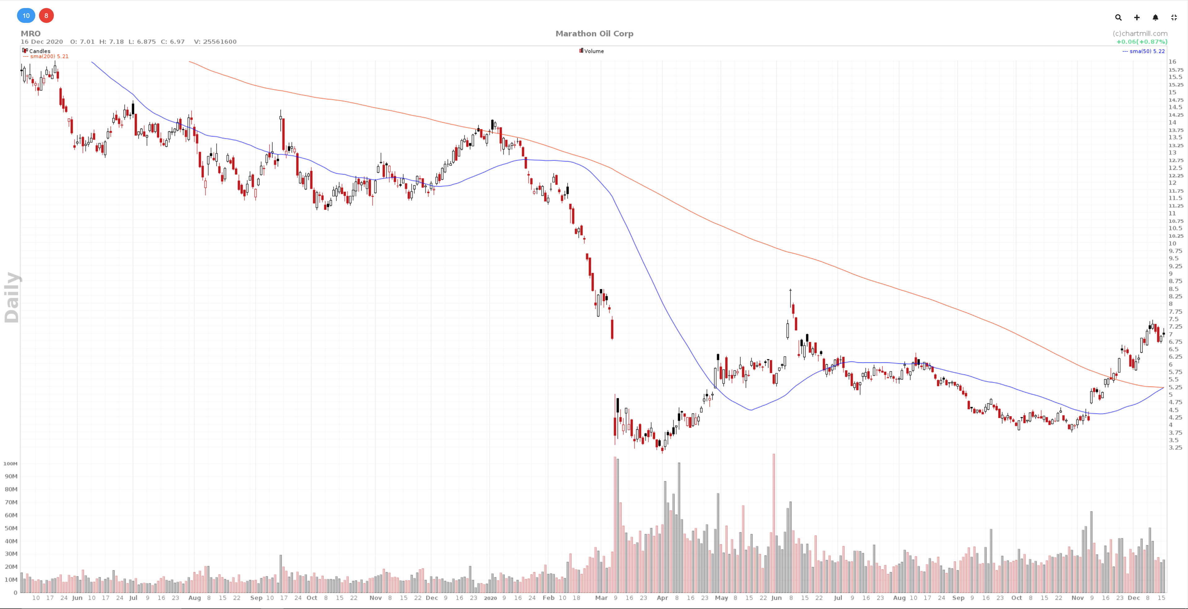
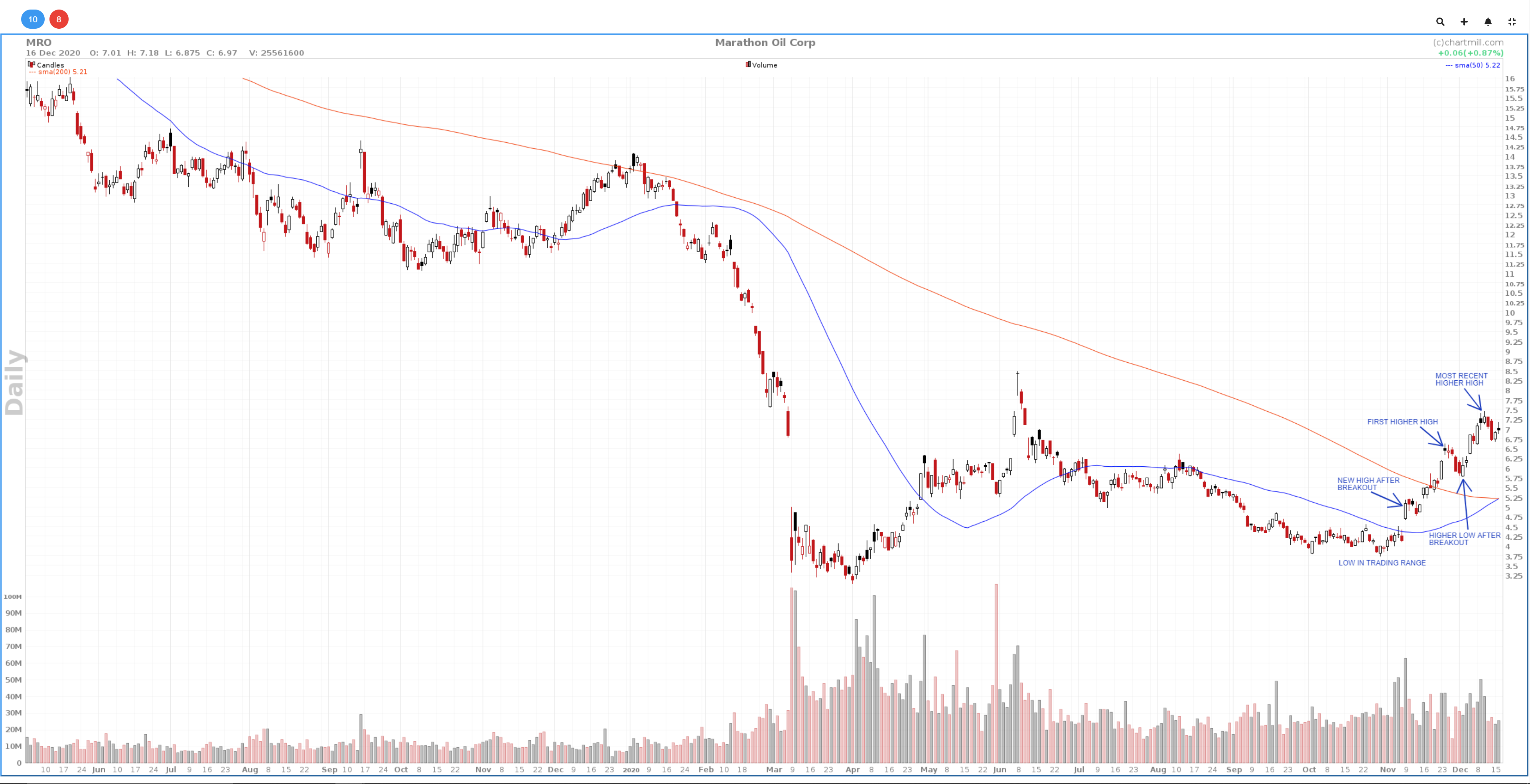
In the example below you'll find the chart of Marathon Oil Corp. (ticker: MRO) on the date of December 16, 2020. The blue line is the SMA50, the red line is the SMA200. That day the short SMA50 cuts the long SMA200 upwards, leading to the formation of what is known as a 'Golden Cross'. This also provides confirmation of the bullish trend that began in the first weeks of November 2020.
From then on we will keep an eye on the chart for possible long setups. Some of the things we were able to determine on December 16 regarding price movement are the following:
- Since the last week of September 2020 until the second week of October 2020, a fairly narrow trading range formed with a price range between $3.8 and $4.5.
- On the date of November 09, 2020, the breakout occurred from the trading range that had existed until then. The share price opened with a large gap and continued to rise strongly, also breaking the SMA50 (blue moving average). This led to the formation of a first new high after the breakout. After a few days of consolidation the price continued to rise above the 200SMA (orange moving average) and a higher high was formed on 24 November 2020.
- After this the price falls back slightly to the $5.8 level where a new higher bottom is formed before the price starts to rise again.
- On December 4, the High that existed until then is taken out. The most recent Higher High (before the formation of the Golden Cross) is at the $7.46 level and dates from December 10, 2020.
- The most recent price development again shows a slight price decline and the formation of the Golden Cross.
When analyzing this daily chart, it is important not to lose sight of the long-term trend. Use the top down approach and include a higher timeframe in your study as well. Therefore, below I have depicted the weekly chart to the right of the daily chart which - as with the daily chart - ends on December 16, 2020, this is when the Golden Cross formed on the daily chart.

On the weekly chart on the right, I have drawn a downward trend line based on the April 2019 top and the lower high that dates back to late December 2019. If this line is extended, we observe that the current price is right below this trend line. Taking into account that the previous 6 weeks the price ended higher each time (6 consecutive bullish weekcandles) it is plausible that this same trendline will act as a resistance that should not be underestimated.
What have we learned so far from this available information?
We already know that the mere formation of a Golden Cross should not be used blindly as an entry signal. MRO is a textbook example of this:
- On the weekly chart, the price is sitting right up against an important downward trend line that is providing resistance.
- On the daily chart it seems that the temporary decline has stopped and the price may have formed a new higher low. However, this is not supported by clearly rising buying volume.
- Moreover, the last candle is a bearish doji candle, which is again a sign of selling pressure and an indication that the decline is not yet completely over.
Suppose we had bought some shares despite these contradictory elements? Let me show you the actual buy setup below on the daily chart.
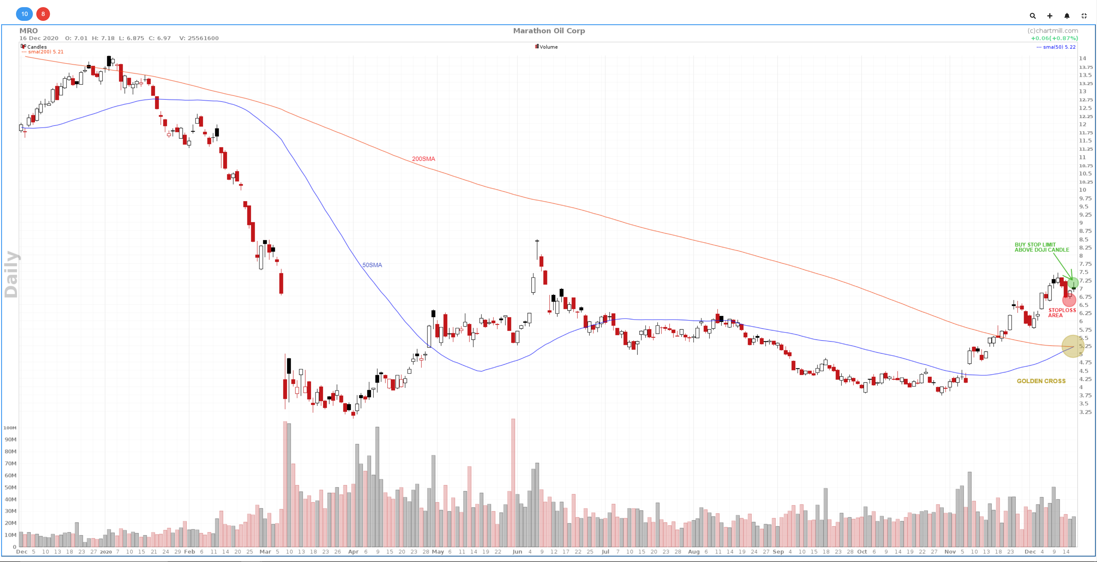
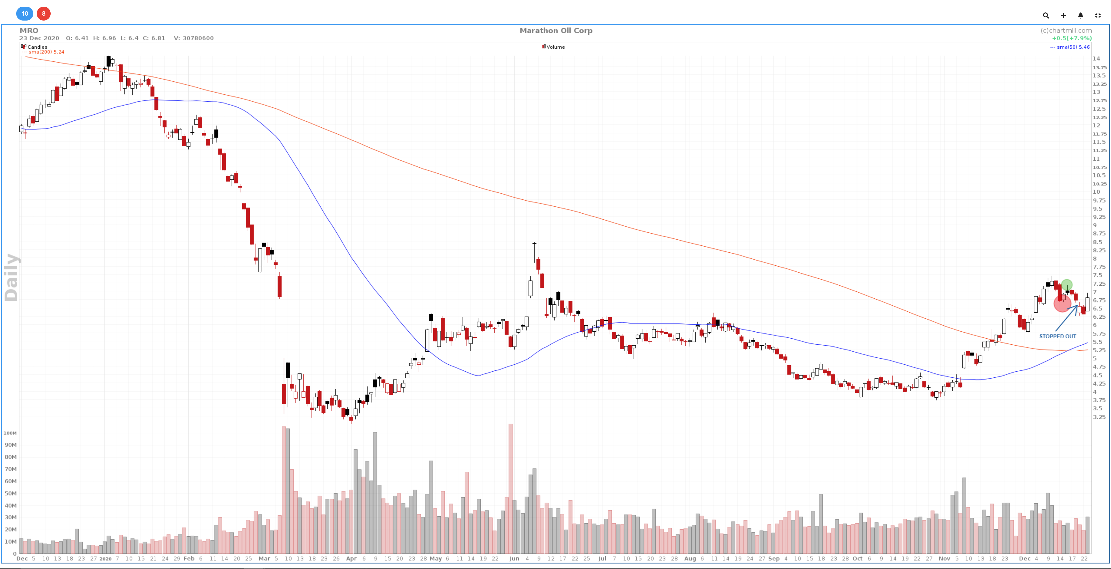
As can be seen on the chart, the long position was stopped out shortly after the entry and the price indeed went lower. However, the trend is still positive as is the SMA50 for that matter which is still above the SMA200. Let's look further to December 31, 2020.
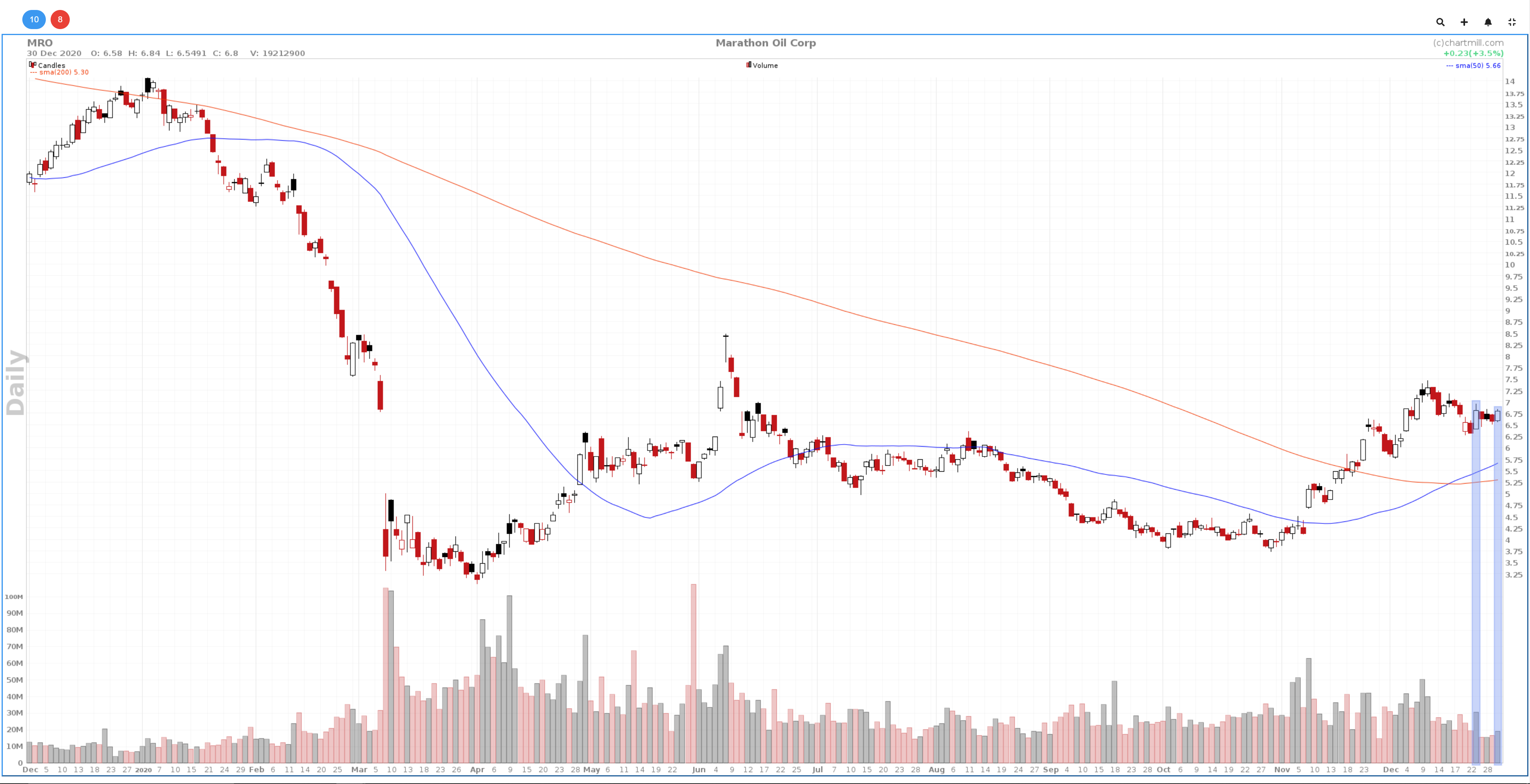
Three things stand out:
- Price is consolidating, the range in which the price moves is becoming narrower in the process.
- The last day of the year ends with an "inside day" candle, the chance that volatility will increase in the coming days is something that should be taken into account.
- The degree of bullishness during the days when the price closes higher are more pronounced than the days when the price closes lower. Moreover, the buying volume on those rising days is always higher than the selling volume on the falling days. The bottom line? We are keeping a close eye on this share until there is more clarity.
Below is the chart for January 04, 2021:
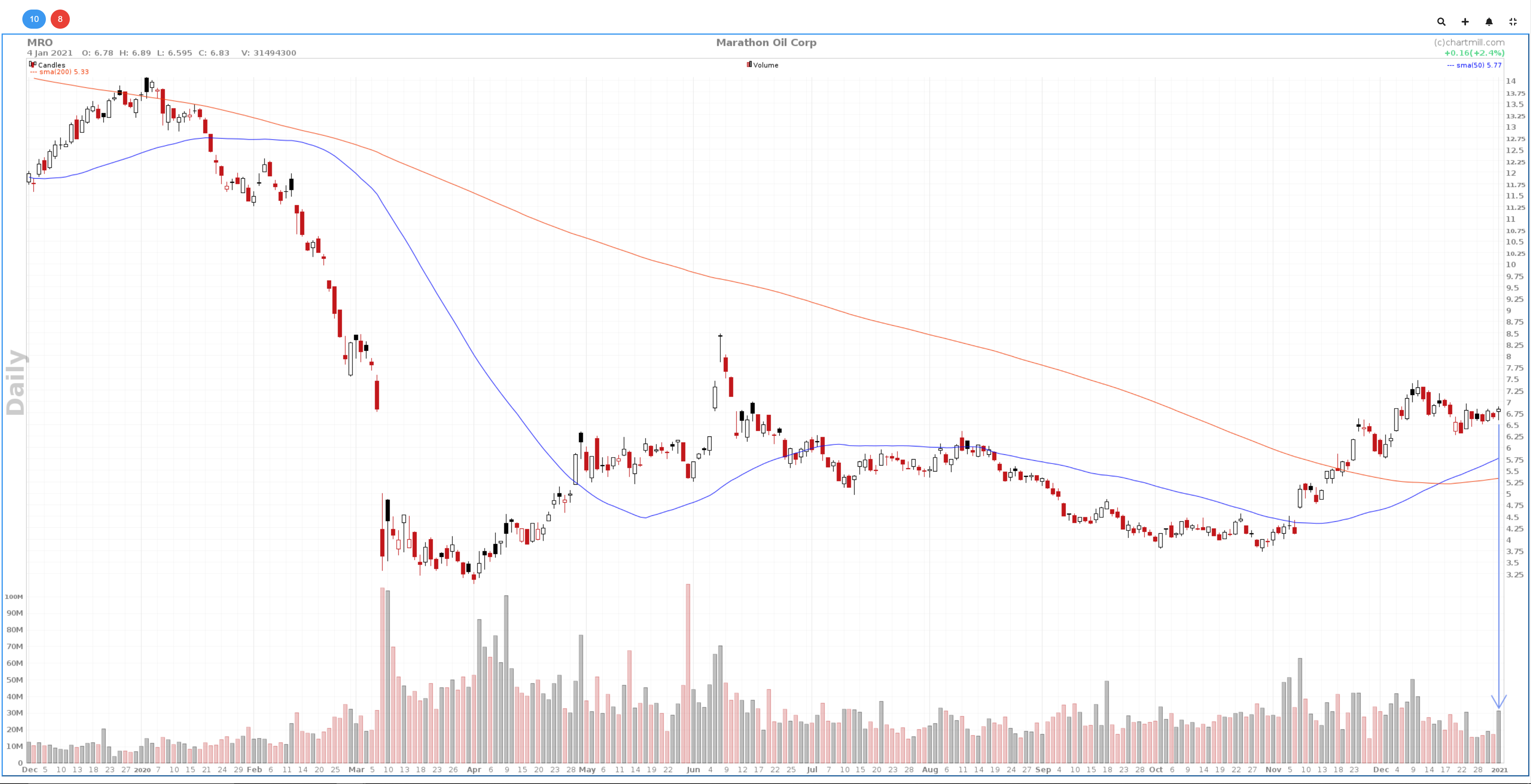
Remarkable buying volume during the formation of a bullish doji candle. Initially it seemed that after the inside candle of the previous day the price chose the way down. However, the willingness of buyers was more than large enough to push the price up again.
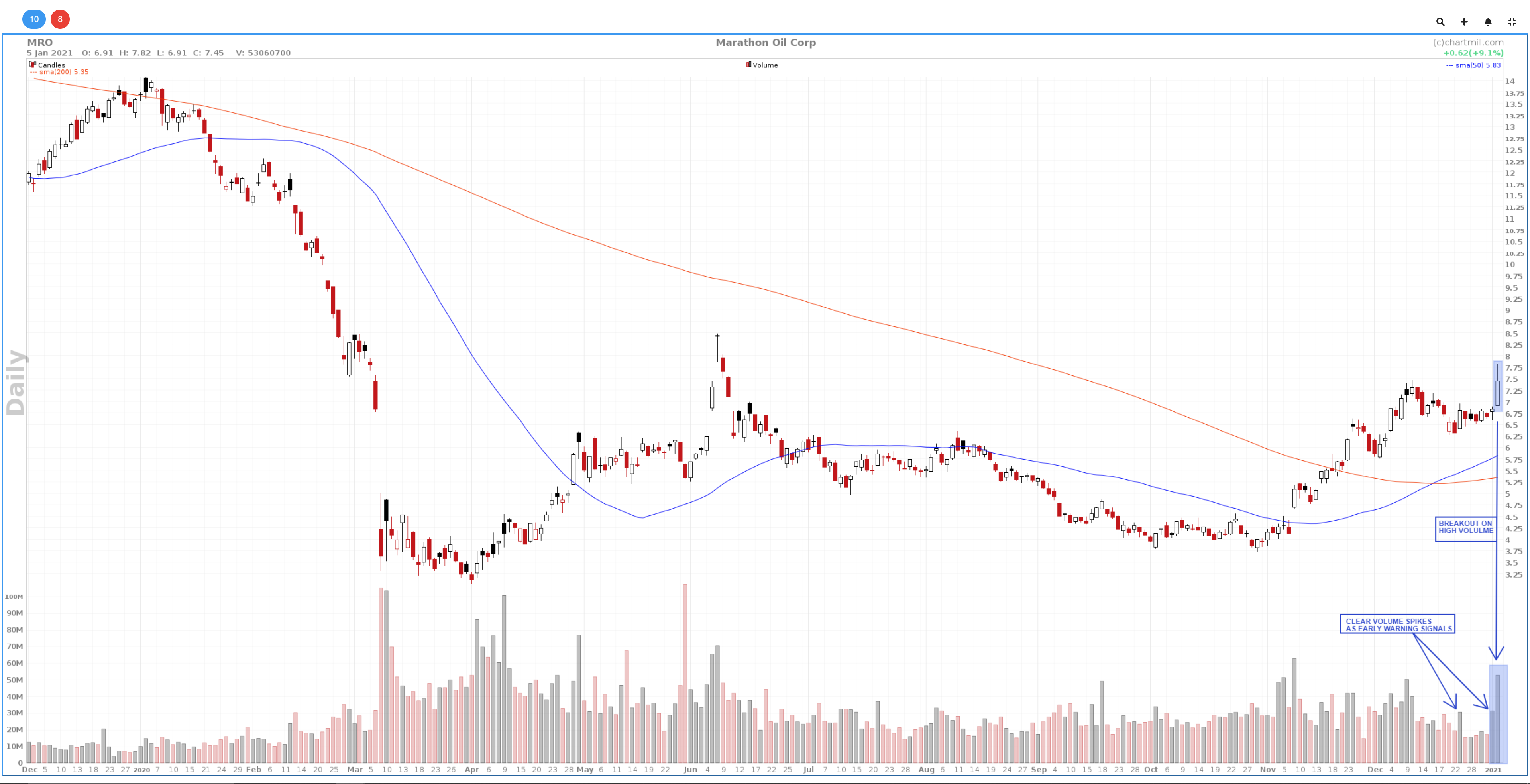
Finally, on the date of Tuesday, January 05, 2021, the breakout occurs under remarkably increased volume. The price rises by more than 9% that day.
And this is the weekly chart on date of Tuesday, January 05, 2021:
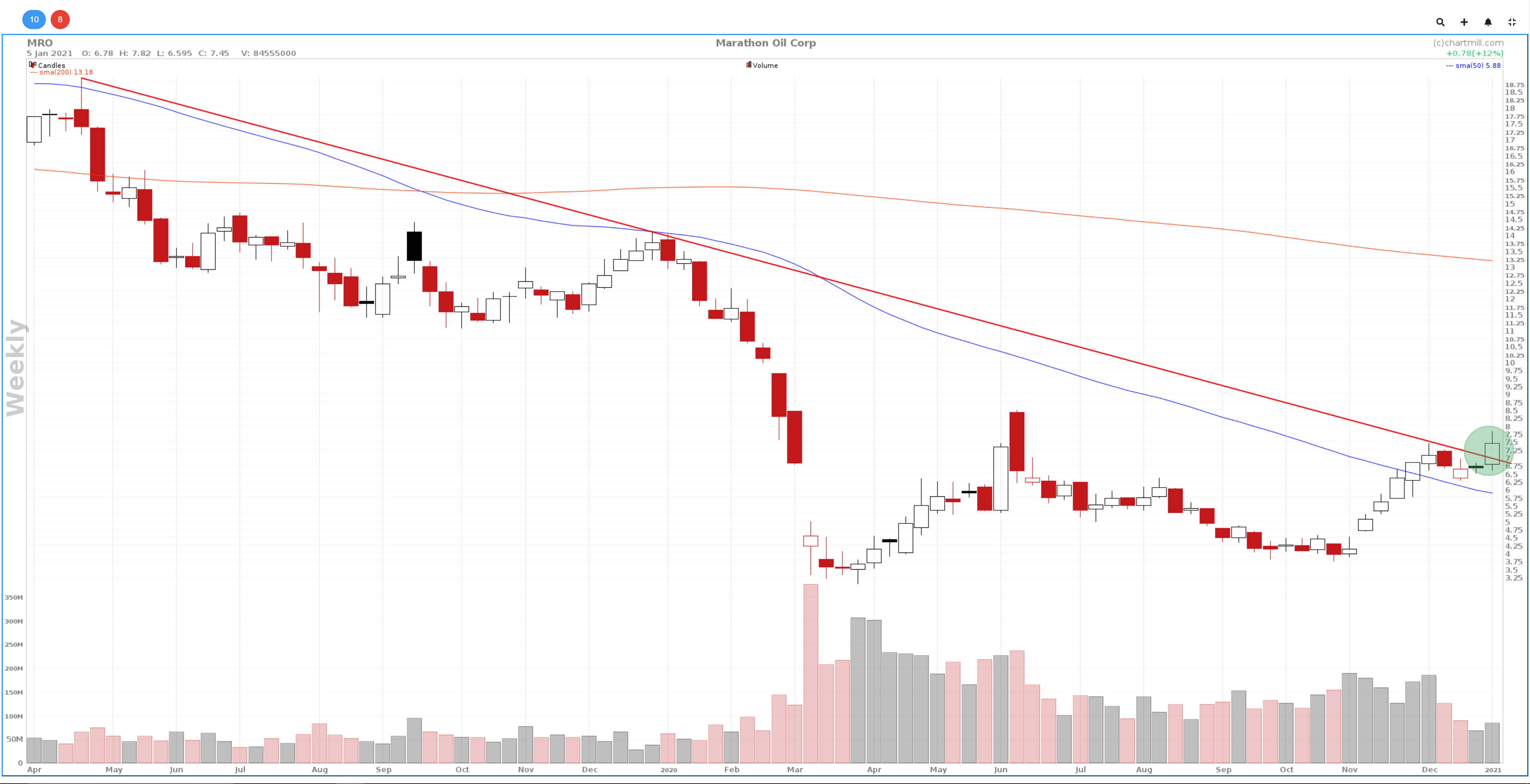
At the same time, the breakout ensured that the descending trend line on the weekly chart was also overcome. On the basis of all these elements a buy order can then be issued. For this purpose we take the high of the break-out candle ($7.82) as the entry zone:
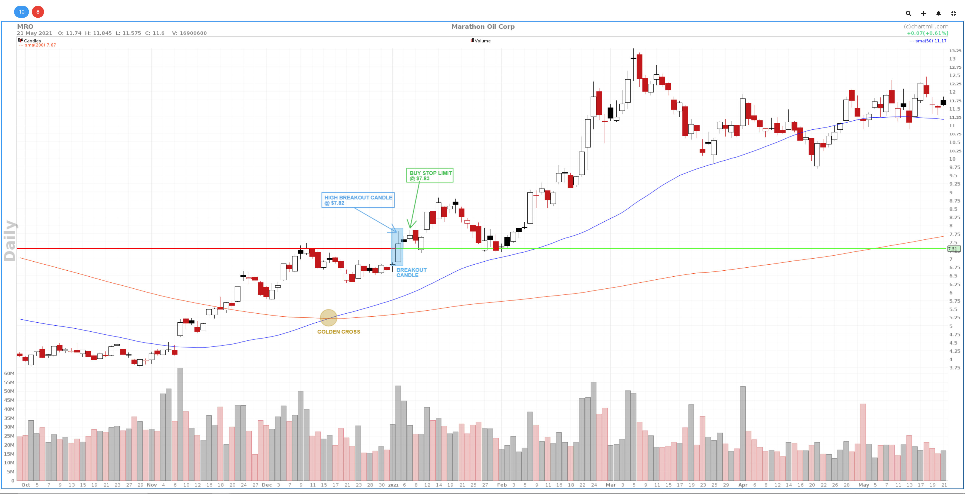
The initial stoploss is just below the blue breakout candle. Following stocks in such a way and patiently waiting for several elements to come together ensures that you can enter the market very precisely and with a clearly defined risk.
Related Articles
Stock Market Golden Cross
This represents a critical technical analysis pattern that occurs when two essential moving averages converge, signifying a potential shift in the market's direction. Read more...
Death Cross Stocks Chart Pattern
The death cross is a pattern that forms when the short-term price average falls below the long-term price average. Read more...
How to scan for the Golden Cross or Death Cross?
In this article, we go over the screen options for filtering stocks based on the appearance of a Golden or Death Cross. Read more...